
The language menu.
It grows out of the button, stretches like a liquid and goes back into it when it closes. Open it.
 English
 CatalàCatalan
 EspañolSpanish
 FrançaisFrench
 Português (Brasil)Brazilian Portuguese
 РусскийRussian
 DeutschGerman
 简体中文Simplified Chinese
 हिन्दीHindi
 العربيةArabic
 日本語Japanese
 ČeštinaCzech
 DanskDanish
 NederlandsDutch
 Português (Portugal)European Portuguese
 SuomiFinnish
 ΕλληνικάGreek
 MagyarHungarian
 ItalianoItalian
 한국어Korean
 NorskNorwegian
 PolskiPolish
 RomânăRomanian
 SlovenčinaSlovak
 SvenskaSwedish
 УкраїнськаUkrainian
No matches
Brand guidelines
How Link3rs looks, sounds and moves. Everything you need to talk about us in our own voice and with our own image.
01
Before a logo or a colour, an idea.
We connect people.
Link3rs takes every event into every language. With Live, the audience hears the AI interpretation on their phone or reads the captions on the screens; with Backstage, the organiser prepares and runs it all. Events only, for companies and institutions: congresses, conferences, trade fairs and venues.
We say what Link3rs does in plain words, without technical jargon or stock phrases.
Real events, real photos, real data. If a figure isn't confirmed, it doesn't go out.
We talk about what Link3rs brings. We never compare ourselves with anyone, and we never talk prices.
Plenty of space, little motion and everything in its place, so it all reads effortlessly.
02
The arrow and the name, always together and always in their colours.
Leave at least half the height of the icon empty all around the logo.
The logo from 80 px wide; the icon on its own from 16 px.
The icon always in brand blue. The name in ink on light backgrounds and in white on dark ones.
Stretched or distorted.
In other colours.
With shadows or effects.
On a photo that makes it hard to read.
03
Lots of white and grey, text in ink and brand blue in the lead. Accents, in small doses.
The blue of the logo. For surfaces, graphics and large headings.
Call-to-action buttons.
Links and blue text.
Text.
Secondary text.
Dividing lines.
Bands and cards.
The background.
Backstage and dark sections.
Orange
Lilac
Green
Pink
Each accent has two shades: the fill, and a darker one for text that reads well on white.
04
Helvetica Neue and a closed scale of eight styles.
The brand typeface.
Only for the names on the event polaroids.
Talent Arena 2026
05
We speak the way we'd speak to an organiser: clearly, warmly and with real facts.
✓Every attendee hears the talk in their language, on their own phone.
✕Forget about booths and the same old interpreters.
✓More than 60 languages.
✕Thousands of events all over the world.
✓Share your event with us and we'll prepare a proposal.
✕Cheaper than any alternative.
✓The captions appear on the big screen, in English and in Catalan.
✕An innovative, cutting-edge solution.
Always written the same way, with their capital letter, and never translated.
06
Live has two parts and Backstage runs it all. Speech and Captions share the same look, light with the heading in ink; Backstage goes black.
AI interpretation on each attendee's phone, to listen or read in their language.
Real-time captions on the event's screens.
Where Live is prepared and run: before, during and after.
07
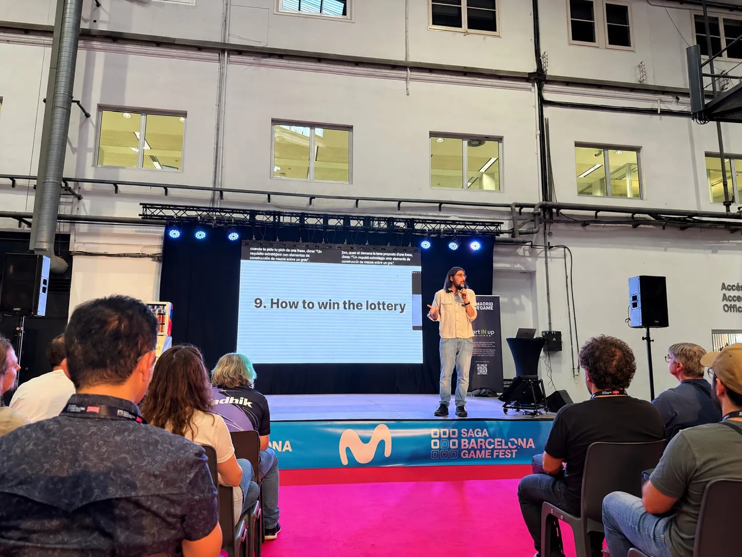
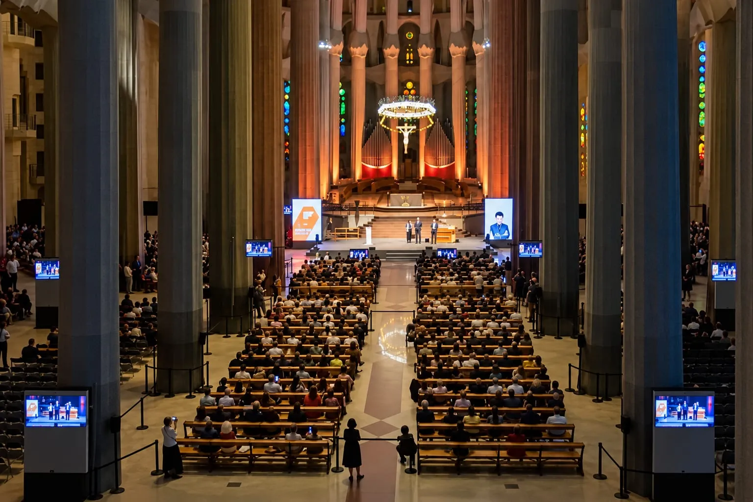
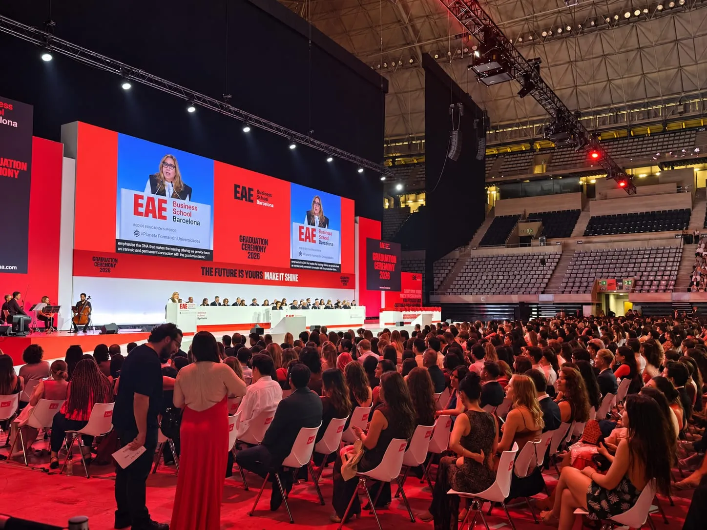
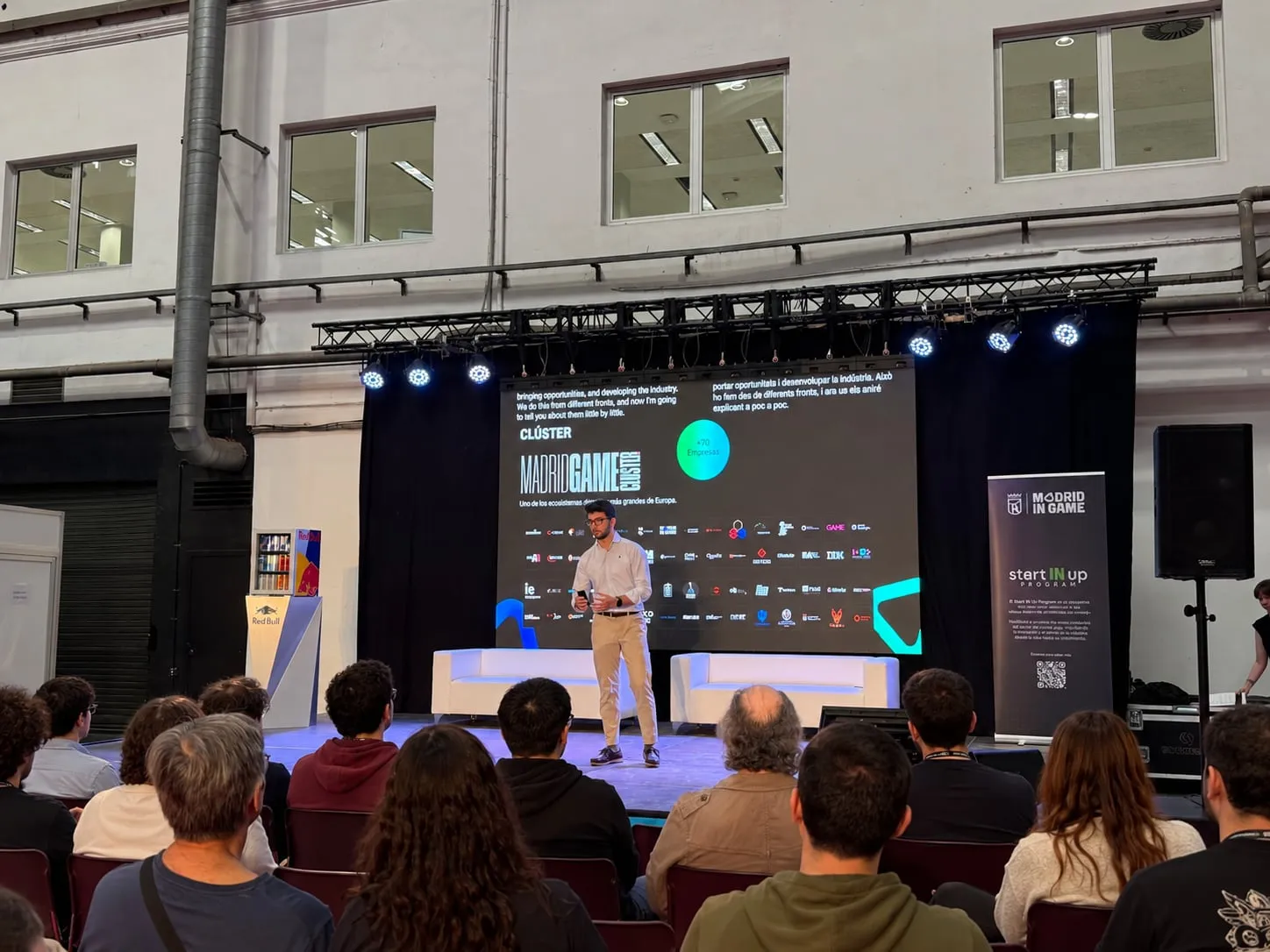
Real events only, with their people and their screens. No stock images.
08
Thin lines and rounded corners. In ink, or in the colour of their section when they go with it.
09
Glass for whatever floats on top, rounded corners for everything else.
The header, the menus and the panels float over the page and let what's behind show through, blurred.
Three radii for everything; buttons are pill-shaped.
10
A little, and always with physics: everything moves with the same springs as the language menu.
It grows out of the button, stretches like a liquid and goes back into it when it closes. Open it.
Touch them and they grow and fill with light; drag them and they stretch like a gel, then bounce back.
On hover they lift a little and what's inside peeks out.
What's at the top rises 16 px and appears, one thing after another.